Consigli Construction is the talent behind some of the most innovative and significant building projects on the East Coast, with an impressive client roster including the Smithsonian Institution’s Renwick Gallery, Beth Israel Deaconess Medical Center, Harvard University and the Massachusetts Institute of Technology. A fourth generation company founded in 1905, Consigli is now a billion-dollar general contractor with more than 800 employees, and is consistently listed among Boston’s Best Places to Work.
THE CHALLENGE:
Bring the World-Class Experience of Working with Consigli to the Web
Consigli constructs iconic buildings that reflect their clients’ personalities, and their new website needed to effectively communicate their own brand’s story. They needed a site that would accurately capture and convey their deep history and heritage in the construction industry, and showcase their award-winning projects and people-driven culture.
THE SOLUTION:
1. Develop User-Centered Design Tailored to Consigli’s Target Users
Our research prioritized two primary audience groups: prospective clients evaluating Consigli during an RFP process, and prospective employees evaluating Consigli as a place to work. It was important that the online user experience offer clear pathways for both audiences to find the most relevant content, and equally important to deliver that content in an engaging manner.
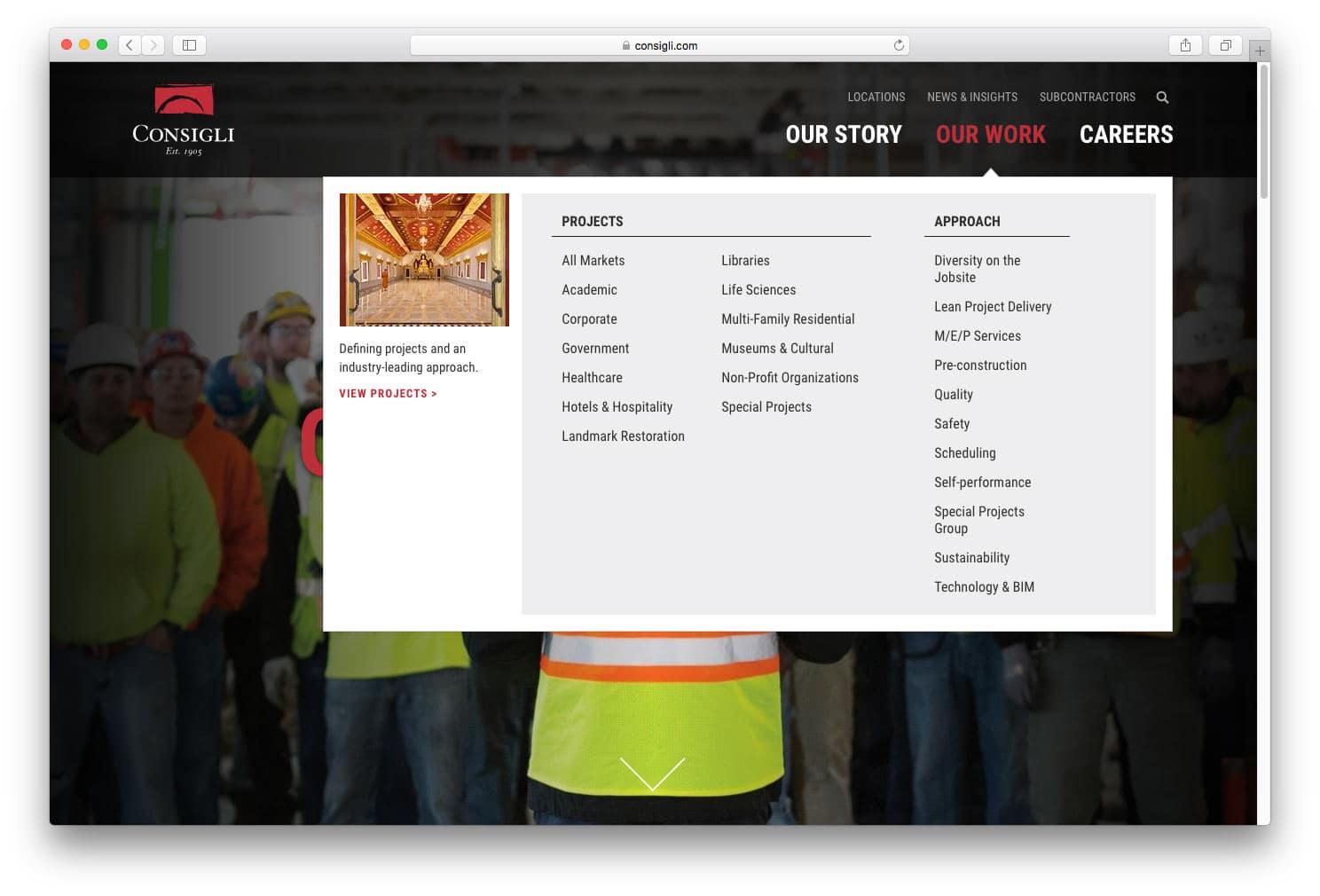
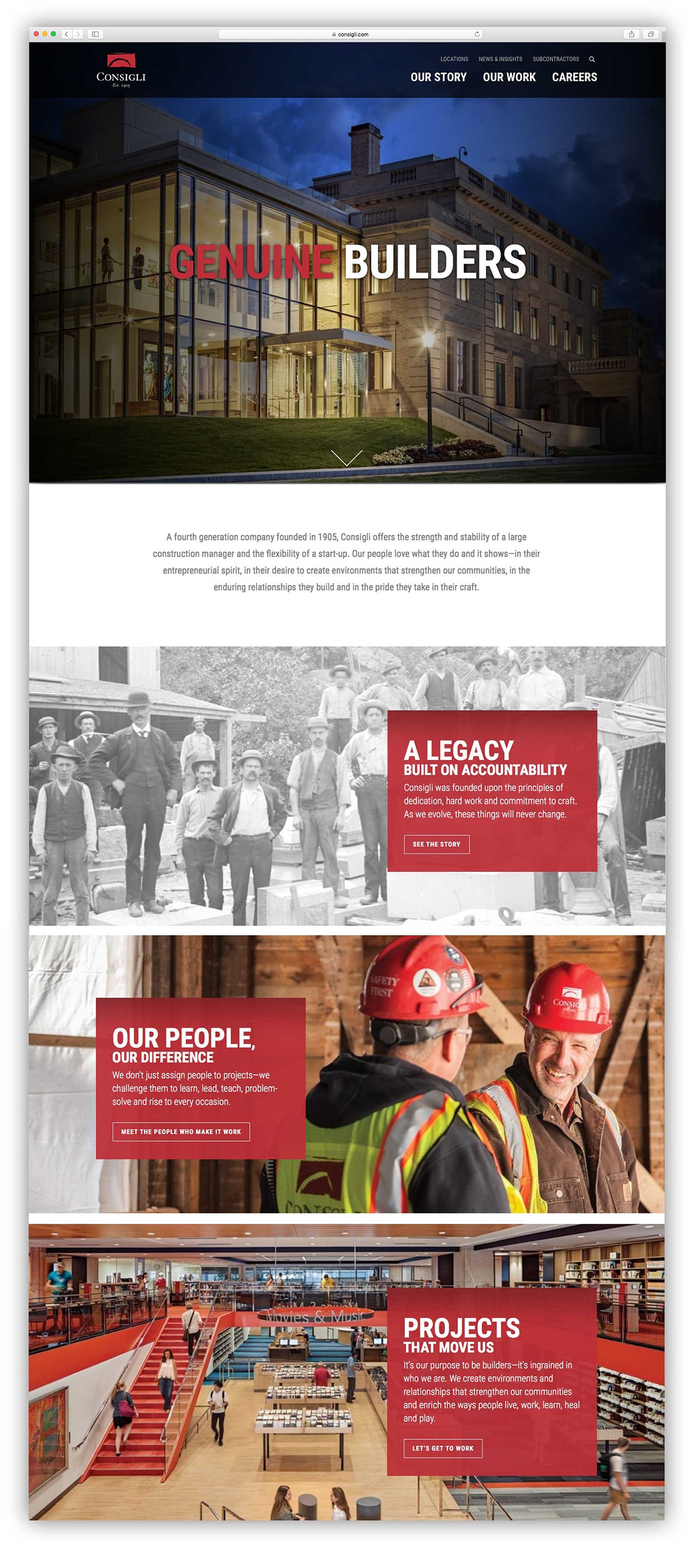
To start, we streamlined the primary navigation into three content areas: Our Story, Our Work, and Careers. We then added mega dropdown menus to provide users with full visibility into each content area, so they can quickly understand the scope of the site and find their desired destination right from the home page.
2. Connect Emotionally with Site Visitors
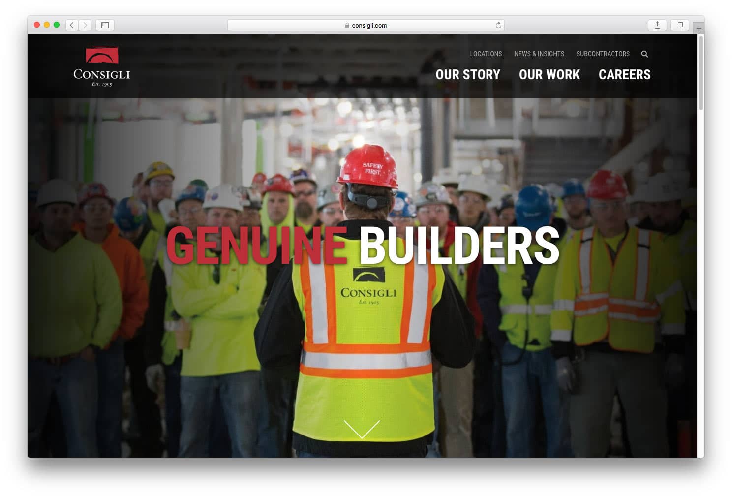
A stellar home page inspires and connects emotionally with users through large-format imagery and high-level brand messaging that communicates an organization’s differentiated positioning. For Consigli, an abundance of beautiful projects provided ample imagery possibilities, and we captured the essence of their construction heritage with the headline “Genuine Builders”.
3. Build a Custom Portfolio Delivering Maximum Impact
Viewing a construction firm’s portfolio of work is a critical aspect of the user experience – for both prospective clients and employees – and has the potential for real impact if presented effectively. We knew it was crucial to completely revamp the portfolio’s presentation and filtering capabilities. With a book of business that spans 12 markets and eight regions, prospects need to be able to quickly and easily view the subset of Consigli’s work they find most relevant. We built a custom filter that allows users to sort results by any combination of market or region, along with the ability to search for projects by keyword.
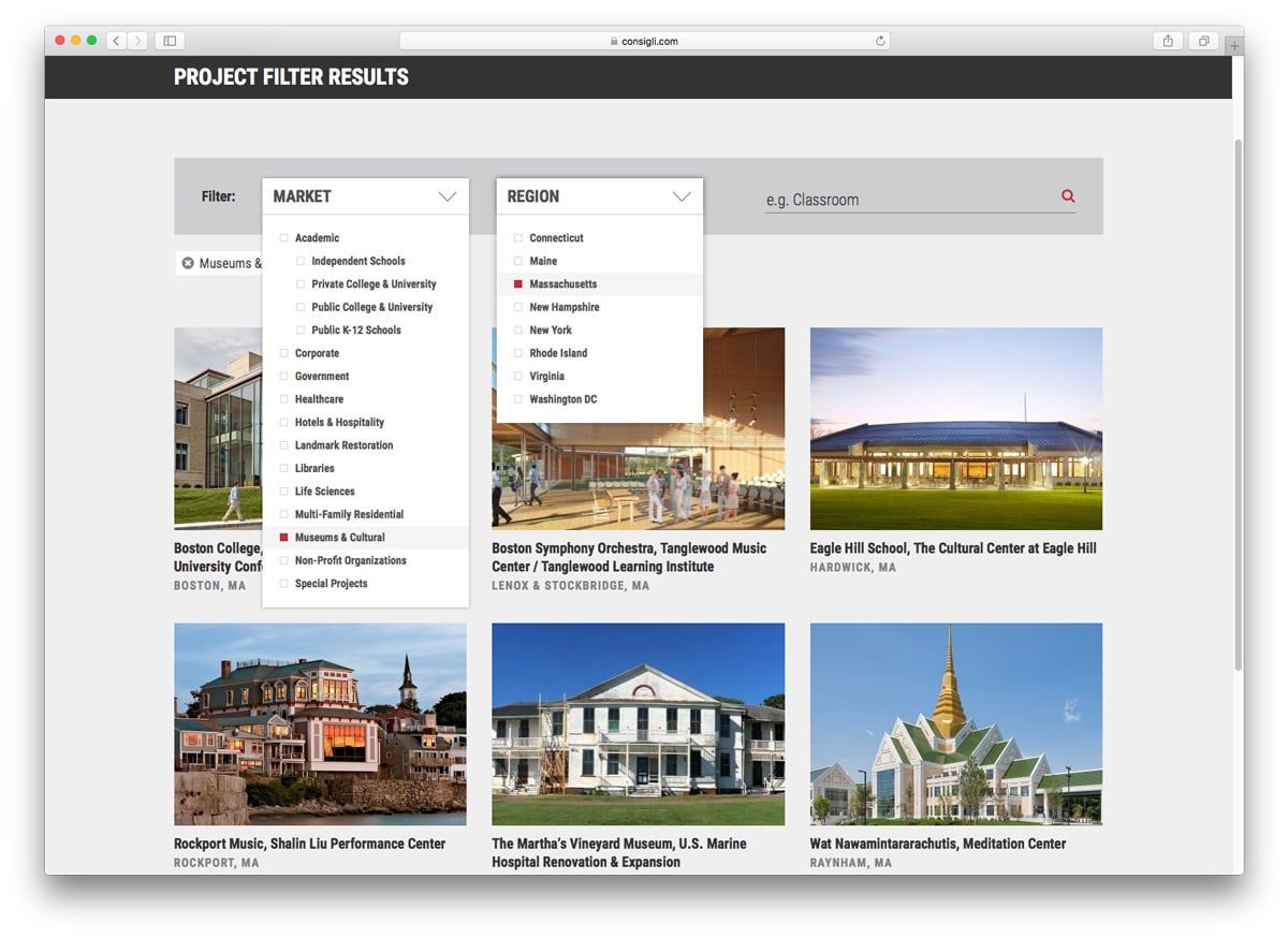
We built market pages that present large project thumbnails, providing users a full and visible picture of the breadth and depth of Consigli’s experience. For users who want to dig further into a project, Consigli’s new project page template provides the capability and flexibility to tell a complete story through beautiful photography, high-level details, project videos, customer quotes, awards and related news.
4. Focus on Consigli’s Culture and Heritage
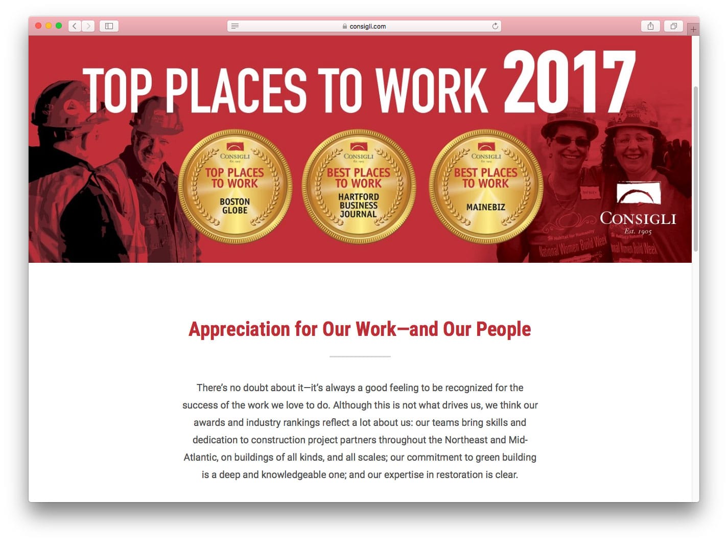
Despite its size and scope, Consigli fosters a uniquely entrepreneurial and “human” company culture, resulting in dozens of Best Place to Work awards. Their employees are smart, committed and love what they do. This cultural aspect of Consigli was important to highlight, particularly for recruiting. Accordingly, we built a page dedicated to awards and rankings.
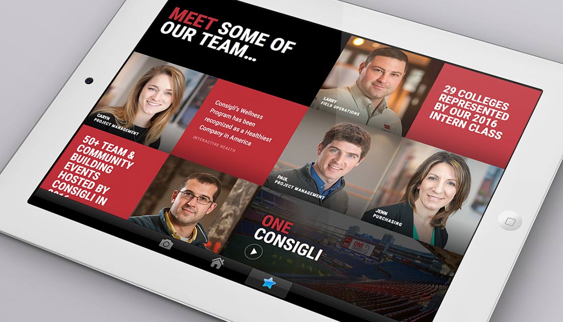
 We felt the best way to convey Consigli’s personality was to let it shine directly through employee testimonials. We created a People section with a collage of employee videos, images and quotes from staff members across the company’s geographic locations and functional areas, giving prospective employees an opportunity to experience the team chemistry and imagine themselves working for Consigli. Additionally, the library of recruiting content dynamically refreshes, so users are introduced to a different set of videos, images and quotes – from 75 different employees – each time they visit the page.
![]()
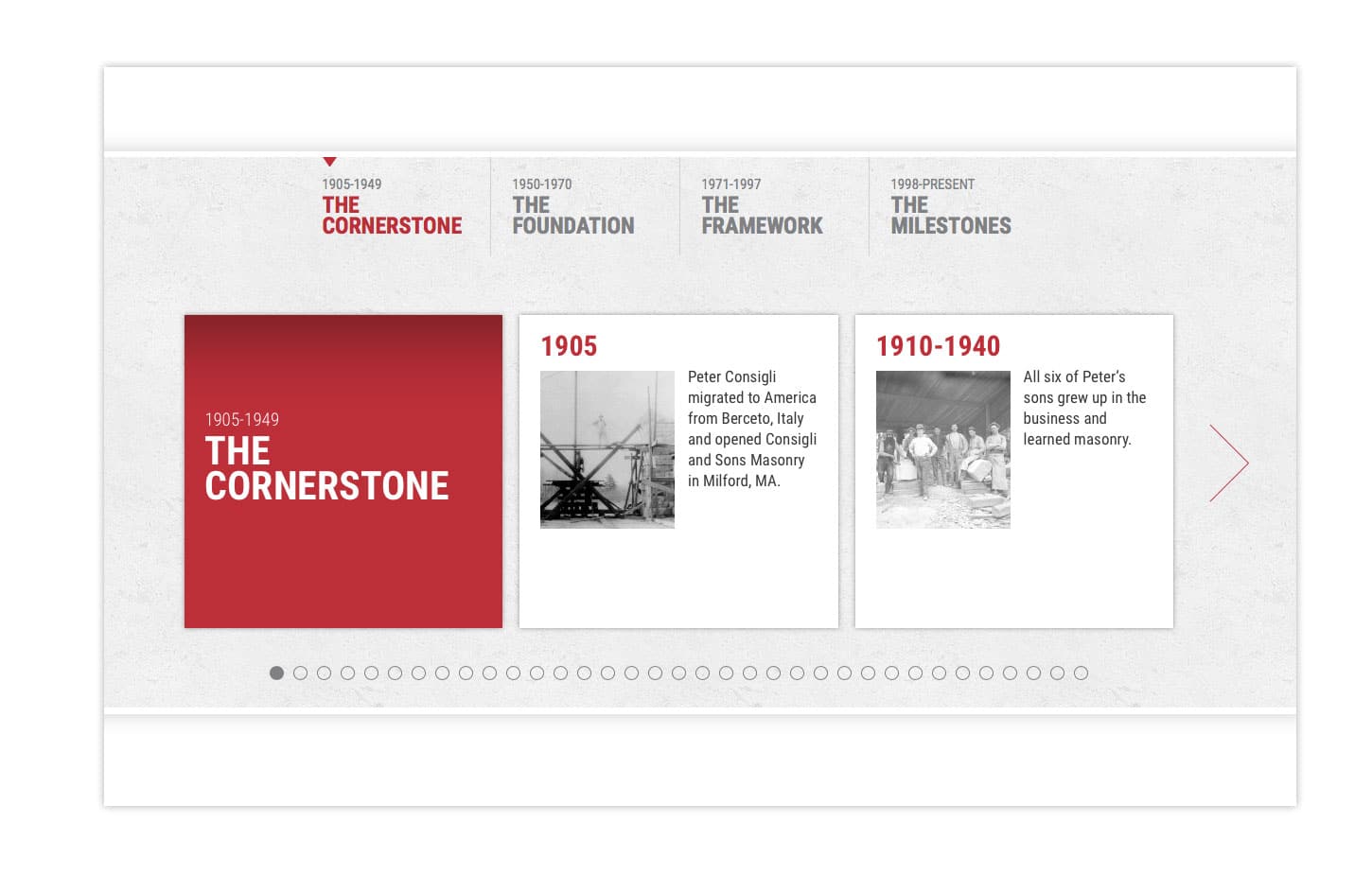
A fourth generation company founded in 1905, Consigli’s history and roots differentiate the company from others in the construction industry. To communicate the company’s unique background, we custom-built an interactive timeline that can be easily updated as the company’s future growth unfolds.
5. Optimize for Mobile Responsiveness and SEO
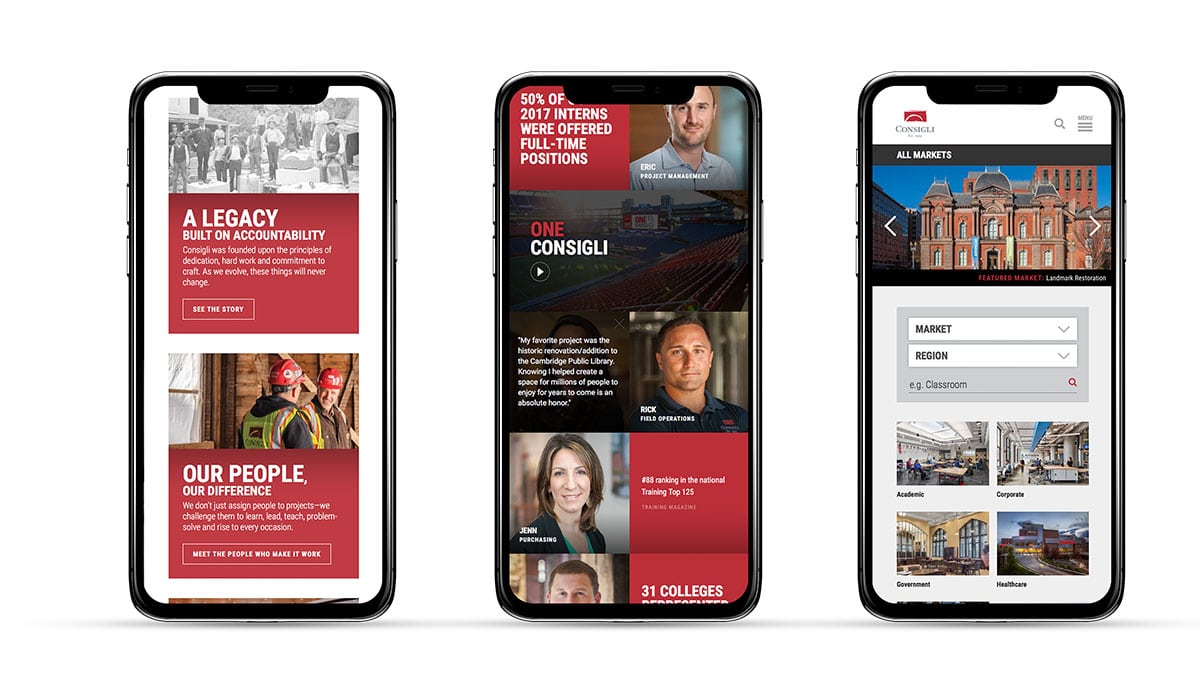
Consigli’s old site was not mobile responsive, making it extremely difficult for mobile visitors to navigate the site. This deficiency was also undermining Consigli’s search engine optimization (SEO) efforts, as search engines increasingly give priority to mobile-responsive sites. The new Consigli site responds flawlessly on mobile devices to keep pace with the growing number of mobile users and search engine demands. In addition, we developed a comprehensive keyword strategy and execution process, which was implemented across the entire site to improve Consigli’s search rankings.
THE RESULTS:
An Inspiring Website that Elevates the Consigli Brand
In just the first few months post-launch, the Consigli website has attracted 16% more users and 19% more traffic over the same period last year. Visitors are more engaged with site content: They are spending 11% more time on the site and visiting 7% more pages per session, leading to a 27% increase in overall page views.
Further, Consigli’s SEO-friendly site has had a tremendous impact on search ranking results right out of the gate. Fourteen of Consigli’s top keyword terms earned significant gains in ranking position, including Consigli’s primary target term which reached the number-one position – a 50+ position gain since the launch!
Most importantly, Consigli is already seeing the new site impact their most important strategic objectives:
“Setter fully understood what we needed and how to get there,” says Consigli’s Director of Communications, Amy Bowen. “We now have a website we are really proud of – one that better represents us as a company. It tells the full Consigli story, showcasing our work and people in a way that has already been beneficial with both recruiting and new business efforts.”
Consigli’s new website has earned national and regional awards, including MCA (Marketing Communications Awards) and SMPS (Society for Marketing Professional Services) Boston.
Check out the new Consigli Construction website.
Want to discuss how your website could achieve greater impact? Connect with us at 617-500-6645.


Leave a Reply